In today's world of touch-and-go media marketing it's important to seize every opportunity you can to make yourself stand out from the crowd. Traditionally, companies have been able to come up with a logo, perhaps a "clever" strapline, and plaster it on their advertisements while calling it a day. Not so anymore.
While a logo is often considered to be a company's most visually recognizable brand element, it should never be to be-all-end-all of your branding efforts. A logo, as paraphrased by Wikipedia, is a "supporting device that maintains visual continuity and brand recognition across all physical manifestations of the brand." In short, a logo is only one part of your brand (albeit an important one).
More than Just a Logo
Beyond the logo a brand is an abstract concept that describes the overall experience that customers receive through a variety of elements (logo, color, typefaces, strapline, and marketing). The most significant step in achieving a strong brand is to keep everything consistent- set boundaries on what can and cannot be done. This means defining how your logo can or cannot be displayed, where you choose to place your ads, and what specific colors should be used at all times.
"A brand is an abstract concept that describes the overall experience that customers receive through a variety of elements (logo, color, typefaces, strapline, and marketing)."
Who would your product or service appeal to the most: a 4 year olds or a 24 year old? Are you marketing to other businesses or to individuals? What's the typical behavior of your target audience, are they always mobile (iPhone, Twitter, YouTube) or do they spend more time reading (magazine, newspapers)? Understanding the right channels to use (Facebook vs LinkedIn) will make a huge difference in positioning your brand better than your competition.
Best Buy, a Good Example
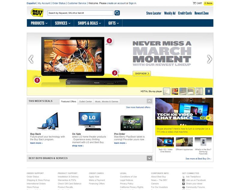
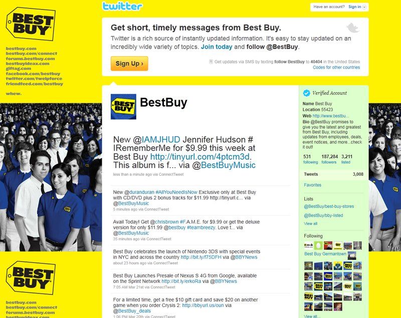
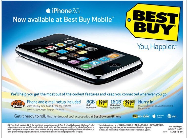
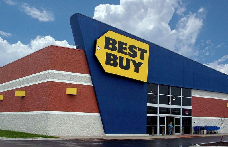
One of the best examples of smart branding currently is electronic giant, Best Buy. Through the use of consistency, Best Buy's tech-savvy brand is unmistakable whether it's on Twitter, Facebook, magazines, flyers, or television. Best Buy even takes this a step further with the unique design of each storefront, emphasizing to customers the company's "cutting-edge" appeal.
Can you see how Best Buy uses its logo in addition to color, typefaces and layout to achieve its presence? Consistency doesn't have to mean that everything looks the same, only that they abide by the same principles you choose to define. The result is a clearly defined experience for their customers and a stronger brand presence in the marketplace.


