This is a subtitle for your new post

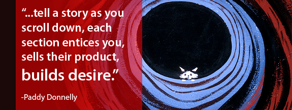
Our PIT leader (Hanan) recently shared an interesting article with me entitled, Life: Below 600px by an Irish web designer named Paddy Donnelly that really struck a chord. In the article, Donnelly conveys the article's point with a clever visual demonstration that flips the current trend of placing all of a site's premium content "above the fold" (an industry term for the space immediately viewable in a browser window, much like a newspaper that has been folded).
Reward Visitors for Scrolling
While he's not the first to cover the topic, Donnelly nonetheless incites his readers to buck the golden rule of cramming as much information above the fold as possible for a more mischievous, and admittedly sensical, approach where
readers are encouraged to scroll the entire length of a page and are ultimately
rewarded for doing so. This reward could be monetary (a special discount), the exchange of important information, or even just a strong call to action. Donnelly makes a lot of good points, many of which are being employed (either consciously or not) by websites that have begun focusing more attention on their footers. For instance, here at
Productive I.T. we've placed a lot of useful support information, our e-newsletter signup form, and a fun team illustration that changes every month all at the footer of our site.
Invite People Down the Rabbit Hole
As both a designer and a reader I can appreciate the unification between a site's content (it's message) and it's overall design that Donnelly is hinting at. Oftentimes, I'll find myself immediately drawn to the footer of a site for (dare I say) the instant gratification of being able to find exactly what I need. Alternatively, while still arguably effective, the big header images that have become a stable of many designs can be accused of being over bearing at times (kind of like a billboard on the interstate). That's not to say that either method is better than the other, both have their place in design. However, it does bring up some new ways to employ these tools (header images, footers) to convey a site's message. Don't be afraid to be creative... invite your visitors down the rabbit hole every once in awhile.
Further Reading:
IAmPaddy: Life Below 600 px
Below the Fold: Why Scrolling Isn’t A Bad Thing
Debunking the Myth of the Page Fold in Web Design


